
JOOST SWARTE
Biblio + Picto
Exposition du 17 mai au 6 juillet 2024


Un grand merci à tous les visiteurs venus admirer l’exposition rétrospective consacrée à Joost Swarte !
Nous nous réjouissons du succès qu’a rencontré ce dernier événement de la saison, précédant notre fermeture estivale !
La Galerie sera cependant accessible, uniquement sur rendez-vous, jusqu’au 20 juillet afin de découvrir un accrochage exclusif mêlant les œuvres de plusieurs artistes. Cette sélection sera par la suite accessible à tous durant le mois de septembre.
[EN]
Many thanks to all the visitors who came to admire the retrospective exhibition dedicated to Joost Swarte!
We are delighted with the success of this final event of the season before our summer closure!
The Gallery will still be accessible by appointment only until July 20th, offering an exclusive display featuring the works of several artists. This selection will then be open to the public throughout September.
_______
Every Picture Tells a Story… ce titre vintage de Rod Stewart, Joost Swarte le revendique en plein : au fil d’un demi-siècle de BD, d’illustration, de graphisme, d’architecture, de design, ses dessins n’ont jamais cessé de conter des histoires. Biblio+Picto, ouvrage récemment paru chez Dargaud, illustre son amour multiforme du papier imprimé. Et à partir du 16 mai 2024, la Galerie Martel sera fière de faire voisiner sur ses murs oeuvres emblématiques et créations inédites de cet artiste dont le mix d’humour, d’imagination et de rigueur graphique tire au cordeau l’âme du monde.
Jopo de Pojo. L’anti-héros totémique de Swarte. C’est lui qui accueillera les visiteurs de la Galerie Martel. Un Jopo sur sa chaise-longue, cerné d’instruments de musique, arborant comme toujours son visage de vieux Félix le Chat ou d’insecte à la Disney, ses knickers de golf fauchés à Tintin, son toupet de cheveux noirs formant une croche. Jopo est né en 1972. Swarte, un peu plus tôt, le 24 décembre 1947, aux Pays-Bas. Adolescent, le graphisme le passionne, mais que l’illustration puisse être une profession ne l’effleure pas. Confrontés à ses faibles résultats scolaires, ses parents comprennent que la pratique peut le tirer de l’ornière. Ils l’inscrivent à l’atelier d’un artiste local, Roelof Klein. De mercredis en mercredis, dessinant des natures mortes, il apprend à regarder et à voir. Il laisse alors ses parents le pousser vers le dessin technique, suit des cours, tâte de l’imprimerie, des couleurs, du design. Sans jamais oublier les leçons de Roelof Klein.
Arrive l’underground. Il montre à Swarte qu’on peut exister par le dessin. Il se lance, crée son titre – Modern Papier -, participe au légendaire Tante Leny Presenteert… De l’épisode, il gardera toujours un sens aigu de ces détails qui donnent au dessin une deuxième profondeur : main sortant d’une bouche d’égout ou ampoule électrique en embuscade dans un caniveau. Bel exemple de cette période touffue – visible Galerie Martel – la couverture de Surprise, la tonitruante revue de BD dirigée par Willem : « Il m’avait dit, prends toutes les libertés », raconte Swarte. « J’ai pensé qu’un traitement un peu ‘X’ serait la moindre des choses ». En effet. En 1977, à l’occasion de l’exposition consacrée à Hergé Kuifje in Rotterdam, Joost Swarte dédie un opuscule au style du Maître et de ses barons. Il l’a titré De klare lijn – la ligne nette, tracée au cordeau, une expression de jardinier flamand alignant ses tulipes. Mal traduit par Ligne claire, le nouveau label fait florès.
Swarte devient la référence de la tendance, qu’il définit ainsi : « Elle recherche la simplicité du texte et de l’image par le moyen du graphisme. » Que dire d’autre ? Depuis, la bande dessinée ne représente plus qu’une fraction de la prodigieuse production graphique de Swarte – mais cette dernière, de l’affiche au marque-page, du portfolio au timbre-poste, est toujours porteuse de récit.
Every picture… Voyez, toujours Galerie Martel, l’original de ses Manicules, Il s’agit au départ de vieux signes typographiques – de petites mains à l’index tendu attirant l’attention sur un point du texte. Swarte s’en empare, les déforme, les transforme en tête de chien ou en interdiction de fumer. « Un créateur de pictogramme cherche souvent l’objectivité. J’aime y insuffler du sens et de l’humour », note-t-il. Reproduites dans Biblio+Picto, ces Manicules y voisinent avec d’autres merveilles – telles les études des vitraux La naissance d’un livre, éclairant les murs du couvent Sainte-Cécile de Grenoble. L’éditeur Jacques Glénat y a installé sa bibliothèque.
Derrière ses rires et ses sourires, Swarte – dessinateur, illustrateur, graphiste, satiriste, auteur pour la jeunesse, affichiste, créateur de comics, céramiste, designer, bref artiste au sens plein du terme – demeure un militant du signe visuel, de l’imprimé à la banderole de manif. Peine de mort, Apartheid, rafles de juifs à Amsterdam, attentats terroristes ont nourri son regard libertaire. Fidèle à ses valeurs, il travaille aussi beaucoup pour l’institutionnel, ou plutôt le citoyen – songez à ses dessins décorant la salle d’attente d’un hôpital destiné aux enfants malvoyants : simples et nets, ils permettent aux jeunes patients d’estimer tout seuls leur déficience. Travaux de commande ? Création personnelle ? Swarte fait-il une différence ? « Oui, mais j’aime que cette différence soit toujours la plus réduite possible. » À l’oeil nu, ses admirateurs auront en effet bien du mal à séparer les deux catégories.
François LANDON
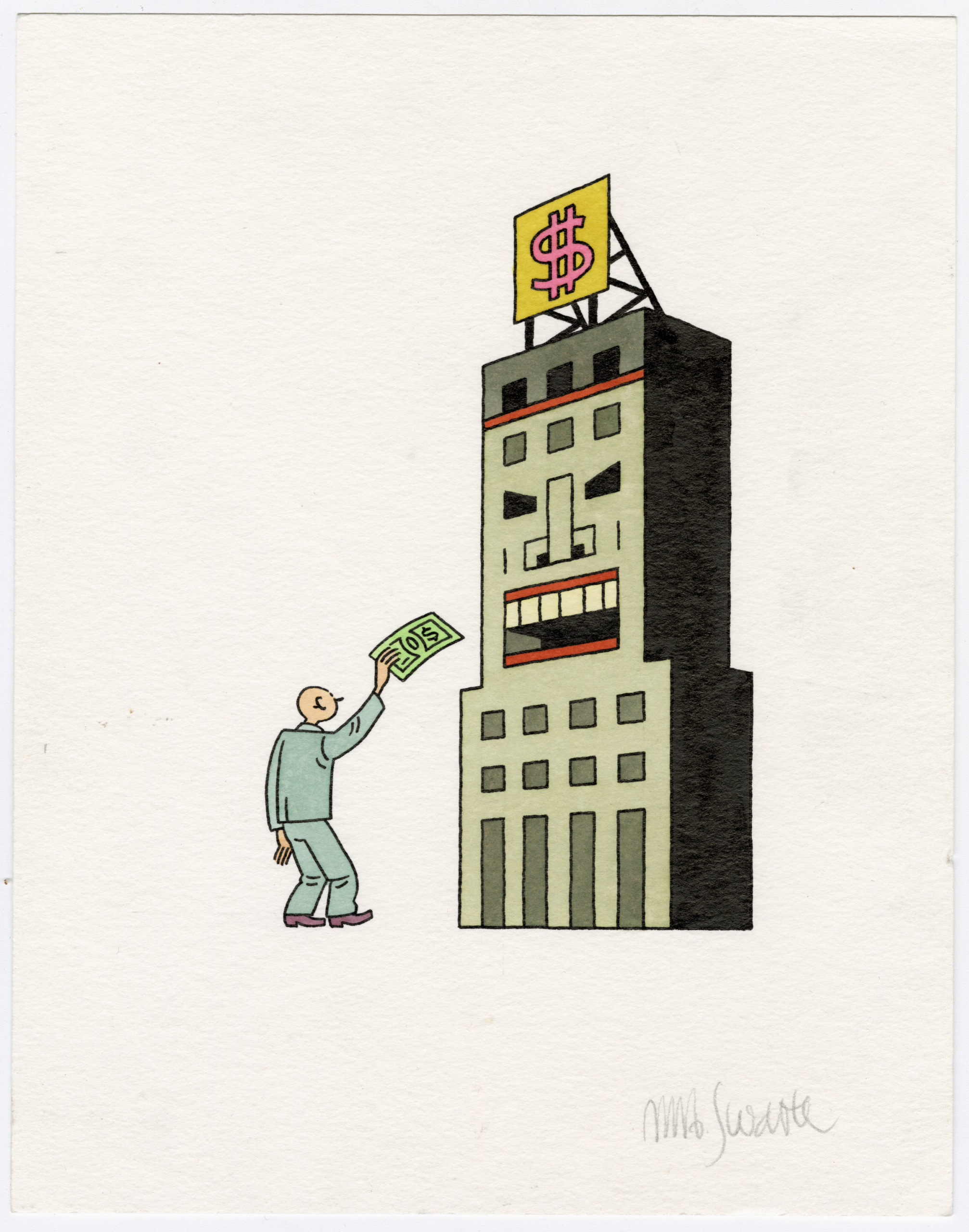
1 – Couverture Robert Benckley « L’économie, pourquoi faire ? » Editions Wombat – 2015
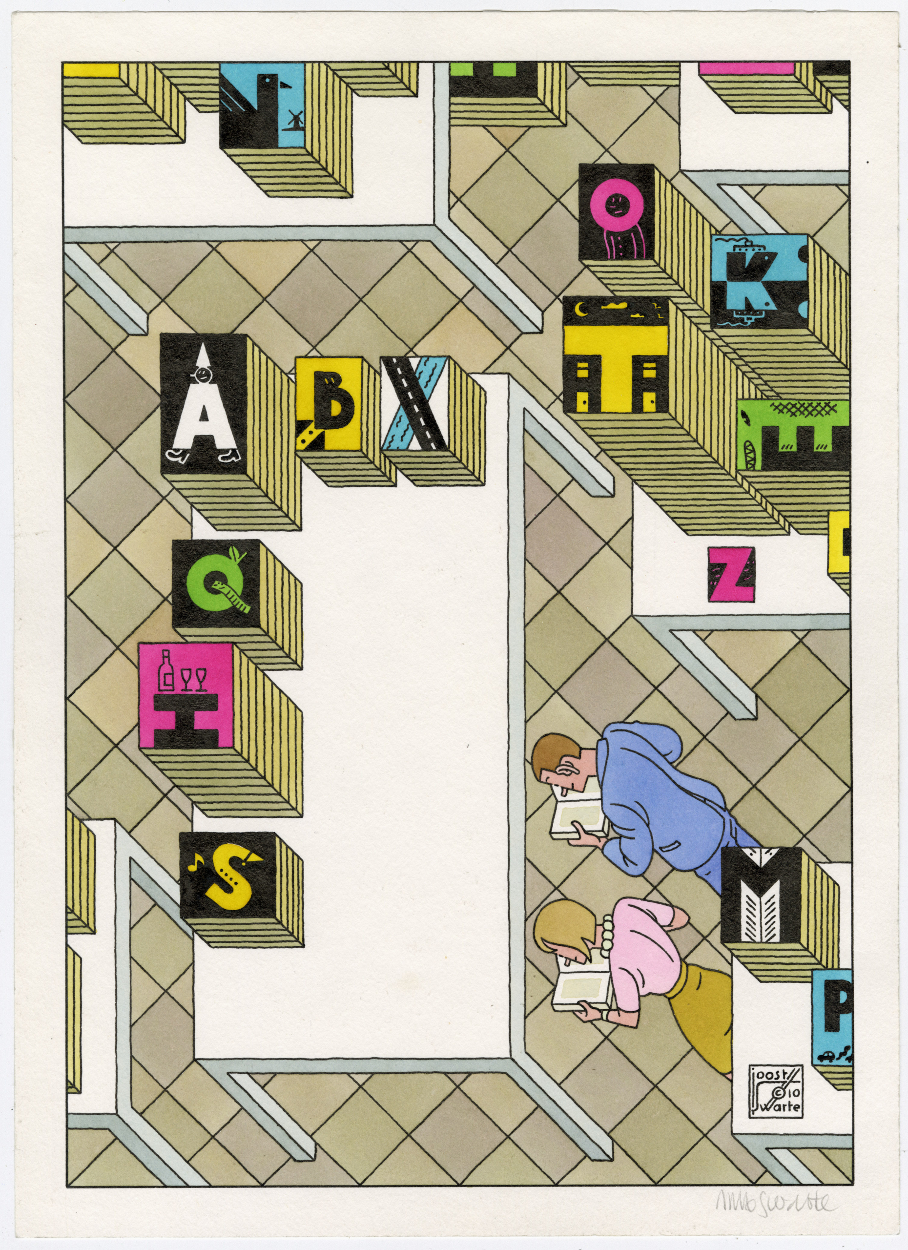
2 – Diploma Boekverkopers Bond – 2010
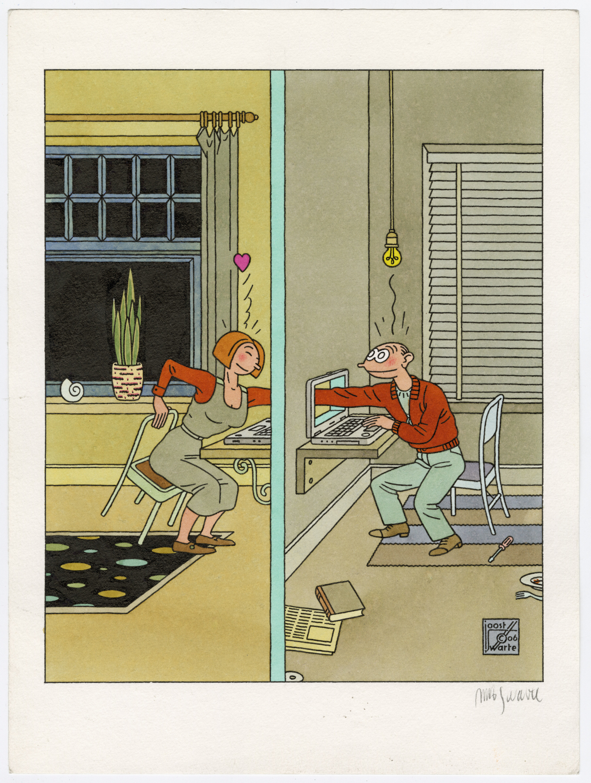
3 – « Internet Love » – Illustration for NRC – 2006
Communiqué de presse (PDF)
______
Nous serions ravis de collaborer avec vous et restons disponibles pour toute demande de renseignements.
Galerie Martel — contact@galeriemartel.fr / +33 6 10 19 30 02.
Éditions Dargaud — Hélène Werlé — werle@dargaud.fr / +33 6 09 67 36 71
Revue de presse
Zone Critique — juin 2024 : Joost Swarte: « Je porte un véritable amour aux livres »
ActuaBD — mai 2024 : Exposition à la Galerie Martel | JOOST SWARTE | Vernissage et dédicace
Ligne Claire — mai 2024 : Joost Swarte à la Galerie Martel à Paris dès le 16 mai 2024
______
Biblio + Picto
Press release (PDF)